Don't think, just do!

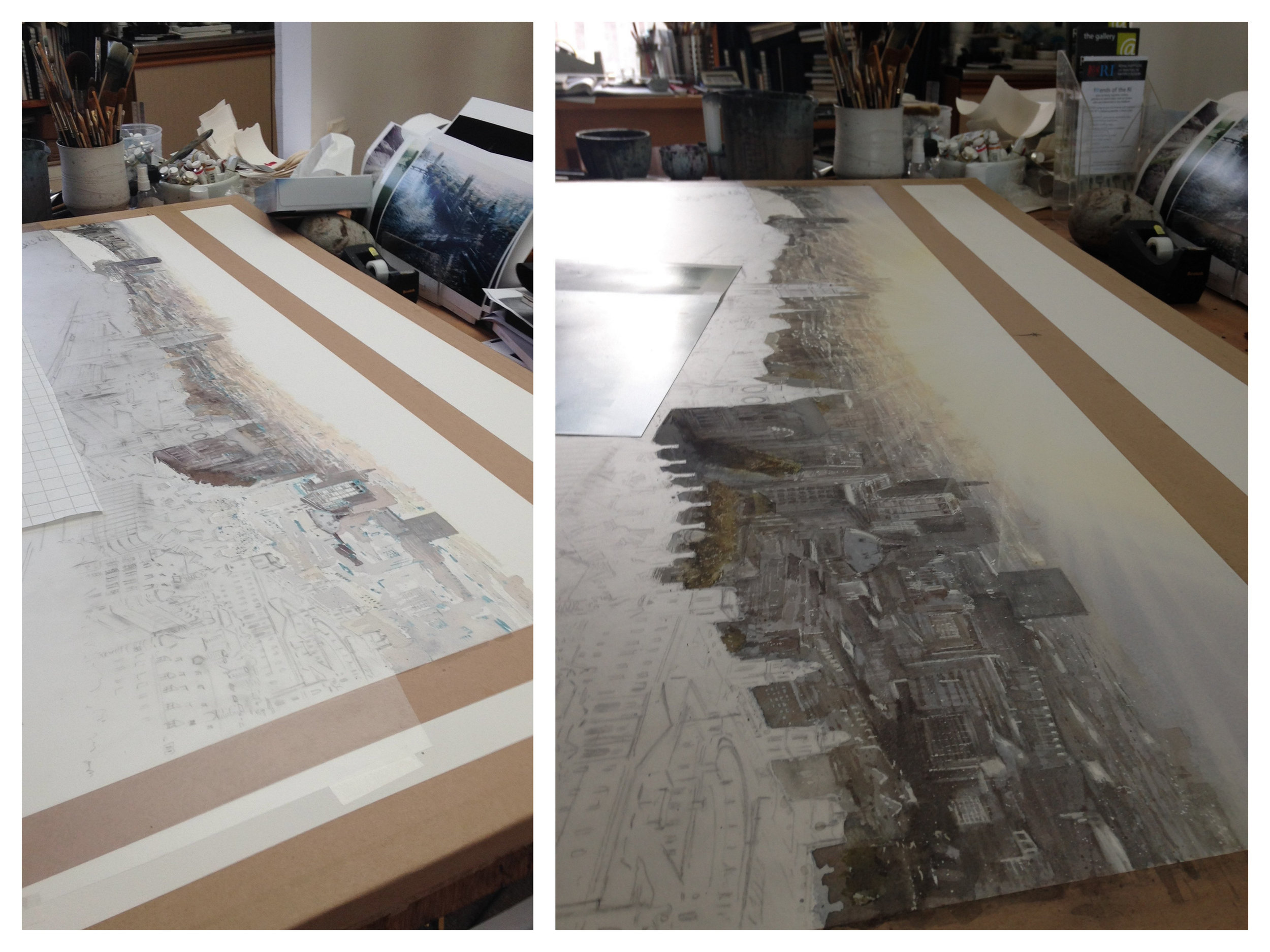
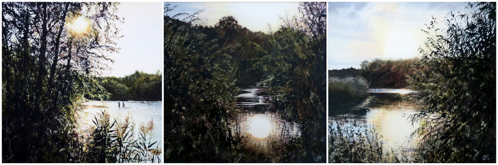
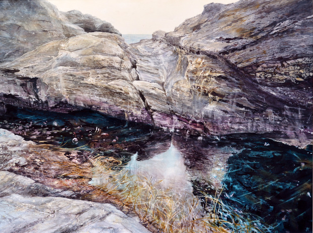
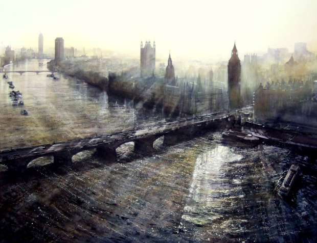
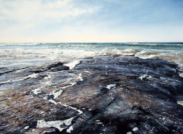
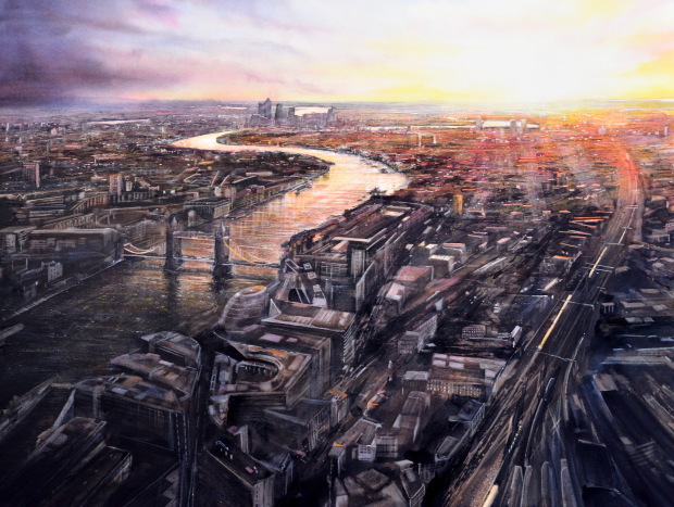
Here’s another excerpt from a recent Patreon article…

There are all kinds of reasons why artists sometimes struggle to create and many titles and reasons have been attributed to this inactivity, or failure to engage. The common name used for this is 'artist's block', but I think this is a rather grand and overarching title that doesn't really explain the experience that covers so many emotions, causes and effects. If you look up the meaning of 'artist's block' it describes a situation where you've run out of motivation or can't find inspiration to continue working. As a landscape painter that doesn't really fit my experience, because the landscape is always there to inspire me. I’m motivated, as the rational me wants to paint, but I can’t get started…….

I engage in activities of work avoidance, actively looking for anything else that needs doing instead of painting. I find ways, consciously or unconsciously, to avoid doing that which gives me joy. Why?! There are many theories as to why we do this, but one explanation I like is that when we are creating we are making something new that hasn't existed before. The possibility of failure therefore, (in our own eyes), is very real and it's scary! So to engage in familiar activities known to us is easier and we keep busy with those to offset starting this new, scary creation that could so easily go wrong and the guilt we feel for avoiding starting it, against what we were intending and actually love to do. This, however, leads to frustration and unease in the long term, which is ultimately destructive. Failure is actually fundamental to the creative process. If you don't fail you never learn and improve.

So how do I break the cycle?……..Find out by going to https://www.patreon.com/DebWalkerRI and joining my Patreon Friends


Excerpt from a recent Patreon article...

There are two trains of thought here...revisiting the same subject again and again can lead to boring repetition and stagnation. This is a repeat of the same painting over and over with only slight variation. Sometimes artists believe it to be a 'successful formula', or 'what they are known for', especially if this belief is founded on sales, but I think this eventually has a deadening effect to an artist's work, as the paintings no longer excite the viewer, because they have 'seen them before'....and ultimately the sales dry up.

However, if the repetition of a subject is spaced out in a painter's development, where they occasionally revisit a subject, they are able to combine their familiarity with the new skills, dexterity and developments in technique achieved since they last considered painting it. This leads to new and exciting developments and charts progress. So to revisit familiar subjects with some restraint can lead to exciting consequences…….

https://www.patreon.com/DebWalkerRI

Patreon

I have a new Patreon page. Please follow the link to take a look: https://www.patreon.com/DebWalkerRI

During lockdown in 2020 I switched to teaching by emailed tutorials. Since then I have continued to make these detailed step by step painting tutorials for those students I am unable to teach in person anymore for a variety of reasons. In order for the tutorials to achieve a wider reach I have launched them on Patreon.

There are three tiers of Patronage, paid monthly by Direct Debit, ranging from £3 - £18.

  • For the £3 patronage, twice a month you receive: 'news from the studio', reviews, exhibition news, drawing and painting tips and tricks, sneak previews of brand new paintings and shots of work in progress. 

  • For the £12 and £18 patronage, twice a month you receive the above and a watercolour tutorial, with or without the opportunity for artist feedback.

Friends receive news, reviews and insights into work in progress.

Excerpt below:

Painters 1 & 2 receive detailed and illustrated watercolour tutorials, with or without the option of feedback

Excerpt below:

I believe explicit instructions are essential for success. Too many ‘how to’ books and magazine articles leave gaps in their step by step instructions, which inevitably lead to frustration. I just don’t see the point in giving incomplete tuition. If its worth doing, do it well!

Excerpt below:

A Distinctive Handmade Box for my Turner Medal

In 2015 I was lucky enough to be awarded the Turner Medal at the Royal Institute of Painters in Water Colours annual exhibition for my painting titled 'Detail'.

‘Detail’, watercolour, H112.5cm x W143cm

‘Detail’, watercolour, H112.5cm x W143cm

In 1856 J.M.W. Turner bequeathed the sum of £20,000 for a gold medal for landscape painting. The modern version of the medal has been cast in bronze since 1938. This much prized Medal is an annual event organised by the 2 senior watercolour societies, the RI and the RWS. Only 2 medals are struck, engraved and awarded each year. 2015 was the last year the medal was awarded.

By coincidence my obsession with J.M.W. Turner’s work has been a lifelong affair, starting at the age of 7 during a visit to the National Gallery in London with my family. It felt like a direct link to the great man himself and remains very humbling.

1-P1230593.JPG

The medal was presented to me by RI President Andy Wood in a little black velvet lined box. The medal is weighty to hold in your hand, at 88 grams or just over 3oz. Bearing Turner's austere profile portrait, it has an air of gravitas and is an artefact in its own right. With this in mind, I quickly decided that I would find a presentation box in which to keep it that would be more fitting. My initial thoughts were to look for a small antique box, but everything I looked at or found was either flawed, slightly too big, slightly too small or not the right shape.

I then came across John Evans of Llanddewi, near Swansea, who makes beautiful individually hand crafted wooden boxes, W: https://www.distinctivehandmadeboxes.com/

John says:

I tend to use indigenous British hardwoods as I have more control over the selection and sourcing. I spend a lot of time looking for those unusual pieces that inspire that special box. 

All of the boxes (unless otherwise stated in the website section) are signed and numbered on the underside. They are all categorised and catalogued for future reference. By engraving, the box's provenance is assured for the future. I'm sure they will become heirlooms and wonder what people will think in a hundred years!

After discussing the medal with John and my thoughts on the home I was looking to find for it we arrived at this box, made from walnut, which would be ideal in shape, colour and size!

IMG_6065.JPG

By modifying the inside with a recess lined with suede to fit perfectly, my Turner Medal had found its new home.

After a short wait while the internal alterations were made I received my box along with a certificate of origin and care.

Certificate of Origin and Care

Box No. 0207

The Walnut (Juglans regia) from which this box is made was from a tree that stood in the town of Bothwell near Hamilton in Lanarkshire. It blew over in a January storm.

This trinket box has some lovely natural grain patterns and features. I’ve left all the surfaces flat apart from the natural corner. Beautifully polished and lined with Ecru coloured natural suede with a recess to house the last Turner Medal. The live edge feature make this a beautifully natural box.

Size approx. 110 x 90 x 45mm

The box is finished with lacquer and polished with natural wax - please do not use silicone spray polish on the box. Only use a soft, clean, dry cloth to dust it if necessary. The timber has been dried to suit a centrally heated environment, please keep the box in warm and dry conditions.

All details of the box have been recorded along with your name as the original purchaser and owner.

I hope owning the box gives you as much pleasure as it gave me making it!

Turner Medal box Feb 2020 024.JPG

It does!


The Megan Fitzoliver Brush Award 2020

I was surprised and delighted to receive The Megan Fitzoliver Brush Award at the 208th RI online exhibition this year with my painting Be Still

Walker_Deborah_Be Still.JPG

It's easy to be moved by an aerial panorama of the sparkling Thames at sunset or to feel the exhilaration of crashing waves on a beach, but there is a different kind of magic to be found in secluded backwaters.

The inspiration for 'Be Still' is from such a place near to my home in Staffordshire. I like to walk at the end of my working day, to breathe and clear my head. It's a quiet time.

A favourite walk is at the far side of my village around tree-lined lakes where I've become interested in the water's edge.

My favourite conditions are depicted in 'Be Still' when there is almost no movement on the surface.

While noticing the spacing of the reeds and their seductive reflections, I'm also aware of the surface tension and below, where reeds have fallen and sunk to create a basket that cradles the whole. 'Be Still' is about looking, being present in the moment, noticing the small stuff and it makes me almost hold my breath.

Kenneth Denton Award

I was delighted to receive The Kenneth Denton Award at the Royal Society of Marine Artists Exhibition in October 2019, with my painting ‘Sunlight and Shadows’

Walker_Deborah_Sunlight and Shadows.JPG

"Old Harry Rocks is a name given to a chalk stack found below the cliffs at Ballard, east of Studland, marking the eastern end of the Jurassic Coast. There are two stories regarding the naming of the rocks. The name ‘Harry’ or ‘Old Harry’ were once familiar names for the devil, like the old saying, ‘to play Old Harry’ which means ’to ruin or destroy’. He is said to have taken a nap on the rocks! The other explanation links the name to the infamous pirate Harry Paye, who used to store his contraband nearby and use the rocks to lie in wait for passing ships. Either way, Old Harry Rocks were so-called as a warning to keep shipping well clear! The blinding sunlight reflecting off the chalk, modelled by softly contrasting shadows give shape and form to the cliffs."

“...for let the form of an object be what it may, - light, shade and perspective will always make it beautiful.”
– John Constable

Concertina thinking

I've developed a habit...I don't think it's a bad one...I think it helps my working practice in general, a bit like a pianist practising scales. Anything that helps break through or keep at bay the 'work avoidance' or 'creative block' thing, that haunts every artist at times has to be a good, surely? A while ago I bought a concertina sketchbook, just because I liked the idea of it. My 'habit', or project, is to draw and paint trees in it as a continuous process.

To cut a long story short I like to walk, when I can, at the end of my working day. It's my time to think about the work I've done and to relax my mind and plan my next move, some of it consciously and some unconsciously (I think). I liken this time to 'the drive home from work'. 'Drive' time is, for many, a cut off point from the challenges of the day, where you engage in the alert whole skill of driving, while weirdly being able to allow your mind to wander, run through ideas and sort out problems. My studio is seven miles from home, too far to walk every day, but at the same time too shorter drive. So my walk is my drive. I take a number of routes, but my favourite one takes me to the footpaths around two lakes at the edge of my village. The lakes are tree lined. In places the tree canopy is dense, so that you walk through tunnels of branches, while in others they are sparse giving a sense of space, but on a good day there are continuous glimpses and flashes of sparkling light on water that I'm drawn to like a magpie.

Concertina for The Artist, in the beginning separate images, DW.JPG

I'm not sure where the decision to fill the first concertina sketchbook full of trees came from, or to make it a continuous theme, other than my thoughts wandering back to the previous evening's walk if the light had been good. At the beginning, I just picked up my pens, got out the ink and gave it a go.

Concertina for The Artist, starting to use multiple pages together, DW.JPG

Each image seemed distinct and separate from the other. This was simply the start of my search for a visual language that would evolve into a kind of diary. I began to start my day, with a sketchbook entry, as 'a way in' to work.    Probably the first thing that struck me was that unlike a 'normal' sketchbook, you can view every page together if you wish, by spreading it out flat. This had to be a huge advantage. I soon began to work on two, three and four pages together. I tried different techniques and processes, different angles and viewpoints, in the search for a visual language to represent my response to the subject.

Concertina for The Artist, using multiple pages and linking sections together, DW.JPG

The great thing about a good concertina sketchbook is that is double sided, (each 'page' is in fact two sheets of paper, back to back), with two long strips of paper placed together before being folded, so once you reach the end you can turn it over and come back the other way. As you are not working directly onto the back of a single page, there is a much reduced chance of the image on one side seeping through when using wet media. Another enjoyable challenge is in being able to link images together, to create an almost continuous story. When you start a new subject you can be mindful if you wish to the previous image, continuing a line or starting with a light or dark area that links to where the light or dark ended on the previous page. Once unfolded this gives the sketchbook a kind of continuity or flow that is very pleasing. At the same time you can decide to end a particular string of images and start afresh by making the conscious decision not to match lights and darks or continue a line. Using all your options, once spread out, the sketchbook begins to look like a visual diary, with 'chapters' of trains of thought.

Concertina for The Artist, images that flow, DW.JPG

Whilst my books are filled with tonal studies of trees and where I walk, I can see that concertina sketchbooks will lend themselves to all manner of subjects and all manner of drawing media. Landscapes, seascapes, panoramas, people, crowds, flowers, buildings, street scenes, still life subjects....whatever your 'thing' is, you can keep a visual record of observations that can be viewed together and kept together. When you can view drawings and paintings together in  chronological order, as you can in a concertina sketchbook, you are able to see the development of an idea or language of mark making as it happens in time. This enables you to compare and contrast the beginning with the end and all stages of the journey, making it a very useful learning tool. I regard this as concertina thinking.

How to make a simple concertina sketchbook from a single sheet of paper

You will need:

A sheet of good quality cartridge paper, A2 or larger

A craft knife or scissors

Paper creaser or bone folder

1          Fold the paper in half lengthways and then fold each end to the middle. Firm each crease with the bone folder, then open it out and flatten it.

Simple sketchbook 2 (2).JPG

2          Fold the paper in half in the opposite direction, then each half to the middle, firming the creases and opening it out to give sixteen pages.

Simple sketchbook 2 (1).JPG

3          Cut from the right side, stopping at the first left fold of the first row. Then cut from the left side, stopping at the last fold on the middle row, then repeat the first cut from the right side to the first fold on the last row.

Simple sketchbook 3.JPG

4          Starting at one end, fold into a concertina, reversing folds as you go.                                                            

Simple sketchbook 4.JPG
Simple sketchbook 5.JPG
Concertina collage, Deborah Walker RI RSMA.JPG

Balancing on the edge

As a watercolour landscape painter who simply 'tries to paint what and how she sees', the subject of using  hard and soft / lost and found edge techniques to create a 3 dimensional world on a 2 dimensional surface is at the centre of my practice.  For me there is a direct link between the use of 'edges' and the way we see. Wherever we focus our eyes and our mind we see clean crisp edges that define an object within its environment. In a painting, however, it is up to the artist to create a focal point and lead the viewers eye towards it, ultimately releasing the eye and completing the viewers' journey. We usually think of a focal point as being established first through composition, but it can also be done by the use of edges. Creating a limited amount of crisp, hard edges and balancing these with soft or even invisible ones helps to direct the viewers eye and create the sensation of 'how' we see.

Edges refer to where one shape ends and another begins. This isn't limited to separate objects, but also a gradation of colour and variances in shading. Edges can be broken down into 4 categories: hard and soft, lost and found.

In all forms of painting hard or found edges are created by placing one colour or tone over or next to another; and soft edges are created by blending one colour or tone with or into another to a greater of lesser extent. However, in watercolour we have another type of hard edge, particular to the medium, where wet paint has dried and created a slightly darker ring around the outside edge of a mark. This happens in watercolour because the paint granules gravitate towards the edge of the meniscus of the watermark as it dries. This only really happens with watercolour and some very liquid inks when the nature of the medium's component parts are not consistent or stable within the liquid. Lost and soft edges can refer to areas, for example, when the edge of a subject / object isn't visible - deliberately painted this way to allow the brain, as it were, to enjoy 'completing the picture'. To summarise therefore, lost and found, hard and soft edges appear in watercolour and can be used to create the illusion of distance, depth and to direct the eye towards a focal point or centre of interest.

As distance increases not only do we lose the colour yellow and then red from our visual field (the ability to see these colours decreases, which is why  distance appears more grey, towards the blue side of the colour wheel), but we also lose the ability to see detail, edges become visually soft, they blur and are eventually lost, until we are left with softer whole shapes. So in watercolour, being able to use a vocabulary of lost and found / hard and soft edge techniques, gives us the ability to create the illusion, on a 2 dimensional surface, of a 3 dimensional world - the way we see it!

Techniques:

Hard or found edges appear in watercolour simply by applying paint to dry paper and allowing them to dry. Soft or lost edges in their simplest form are created by using a wet in wet approach, but here they are simply suggestive and lack structure.

Therefore I will focus on techniques you can use that follow 2 strands:

·         Creating a hard or found edge, then softening or losing it to suggest the natural blurring of distance.

·         Creating different types of soft or lost edges that create depth in a 3 dimensional world.

'Guillemots, Sea beet and Tree Mallow' detail.JPG

 Softening or losing a hard edge to create distance:

To create whole retained shapes in the distance that have lost detail we need to first paint the shape and then lose it. I do this by painting the structure in as much detail as I can see naturally and allowing it to dry, taking care to use the best match for colour and tone.  Once dry I tilt my painting and wash the surface with clean water, allowing the water to progress downwards. This softens and washes away the darker ring around the outside edge of the marks. In the example above, a detail of 'Guillemots, Sea beet and Tree Mallow', this has been done with each headland, matching colour and tone until I arrive at the foreground structures that will keep their hard edges.  Only then I paint the sky over the whole area, essentially dropping all of the cliffs back behind a grey / violet glaze.

'From The Eye' detail.JPG

The example above, a detail of 'From The Eye', illustrates a similar use of washing out hard edges, almost completely as the view disappears into the sun, using a wide range of tones to exploit the contrast, creating almost infinite distance.

Creating lost or soft edges that suggest structured depth:

The image, 'From The Eye', also gives an example of creating depth using soft edges at the point where the Thames meets the embankment on the left. We don't see a line where the water meets the wall below the trees, neither do we see hard edges to the reflections in the water of the towers, trees or walls above. These soft edges have been created by applying the darkest shadow colour to where the edge 'should' be with the board tilted and then quickly running that colour both up down with a large brush loaded with clean water, to mirror the structure above. As the board is tilted the softened edge will have more of a downward drag of colour, with minimal paint travelling upwards, against gravity. The fact that we don't see an edge as such allows the brain to complete the picture and understand what is going on. Here we allow painting what we see without revision to override what we know about the structure, that water meets a wall, where we think, or 'know', there must be a line where they touch.

The following example of silhouetted trees against a misty lake, again uses the technique of creating almost invisible edges to the far banks, with darker paint added below structures and washed down with clean water. Here I have also used the technique of lifting dry paint from the picture surface using a damp chisel brush and tissue to create soft edges. On the water surface in the bottom right hand corner around the coot, once the painted surface is dry, I have used a damp chisel brush to draw the suggestion of concentric circles, stamping away the damp paint with a tissue to create the illusion of movement. By using a strong contrast between the totally soft edged background and the hard edged silhouetted foreground tree and branches painted wet on dry, I give the illusion of depth and distance, an internal space within the picture.

'Pale Sun Lifting Mist', watercolour, H86cm x W119cm, Deborah Walker RI RSMA.JPG

The painting of St Paul's from the Millennium Bridge,  'Time present, time past', illustrates how to lose edges, create soft edges and at the same time use hard edges to lead to eye to the focal point. The soft edges are used on the reflective surface of the bridge by painting wet into wet initially, strengthening the colour at the bottom. The painting has been turned upside down to apply a further dark wash, run out with clean water to achieve the depth of colour. Once dry the surface has been structured by lifting off horizontals and verticals as previously described with a damp chisel brush, creating a flat surface of shadows and reflections. The top edges of the buildings , left and right,  have been softened dramatically with the application of a thick dark wash over the previously painted walls, dropping them into deep shadow. By painting this dark wash around St Paul's, leaving a crisp hard edge, the eye is directed to the focal point assisted by the diagonals in the composition.

'Time present, time past', watercolour, H60cm x W56cm, Deborah Walker RI RSMA.JPG

The way we see is something which continues to fascinate me. Balancing the use of hard and soft, lost and found edges is just one of the processes that allows me to create the illusion of reality.

A Commission; 'From The Eye'

I don’t paint commissions…

I don’t paint commissions generally, because in painting by request you accept responsibility for the clients expectations, risk ‘not connecting ‘ with the subject and being unsure of the outcome. All stressful.

This commission was to paint the view from The London Eye to include on the right, the Treasury where the clients met, with Westminster Bridge and the sweep of the Thames on the left. Having painted this subject many times, in many sizes and formats, I could see that this would extend what I have previously achieved and would therefore be a challenge.

I said yes.

Painting a watercolour on this scale is not something I can dive straight into. I have to get my head around the many considerations of size, composition, lighting, process, the ‘order of events’, that I suppose can be called ‘having a plan’. Planning takes time, largely in my head, working mainly on the ‘order of events’. With a certain amount of familiarity of subject it soon became clear that while I had to work up to painting on my 3ft x 4ft board once again, the biggest challenge by far would be the added streets and buildings to include the Treasury. I had to let go of the importance of the Treasury for the clients in order to depict it naturally without feature, nestled among the other buildings in Whitehall. I see painting buildings as a bit like painting portraits, in that they have to be ‘right’…..because if they’re wrong, they’re soooo wrong.

I think of the quote: ‘ A portrait is a painting with something wrong with the mouth’, by John Singer Sargent. In painting Big Ben and his friends, its important to me to not paint the mouth wrong, because if you do, it just screams at you that you failed to get it right! The painted form may just be a collection of drawn and painted marks, dashes and splashes with lost and found edges, but they have to have landed in the right place.

IMG_8492.JPG

Onto practical considerations, first comes the stretching of the paper. Handling a 3ft x 4ft piece of wet watercolour paper and turning it over on the board to tape it down, is a bit daunting and again has to be ‘worked up to’! It demands space, time and coffee.

Commission From The Eye.jpg

The process begins with the background cityscape, placing and balancing marks and tonal blocks that suggest buildings without detail, laid out in their patterns that form believable streets. I don’t draw on the paper with pencil, I use dilute watercolour and a dip pen to gradually map out my composition, working from the background to the foreground, using a sheet of plastic to cover and protect the unpainted paper while I work. Once what I consider to be the whole of the background is in and is totally dry I then paint the sky over the top, which involves re-wetting the whole area and dropping in colour, managing the white light of the sun and lifting the shafts of sunlight as the wash dries. Again this demands more space, more time and more coffee.

Once I am in the foreground it becomes a matter of painting portraits, before at last diving into the water and pulling the whole thing together. When you get up close to these large paintings, as a whole they exceed the visual field, so I like to make them give again, by including small passages written by hand in watercolour paint of poetic phrases and factual detail particular to the subject, in this case almost hidden amongst the buildings and ripples on the water.

“Ne’er saw I, never felt, a calm so deep!

The river glideth at his own sweet will:

Dear God! The very houses seem asleep;

And all that mighty heart is lying still!”

William Wordsworth: Poems, in Two Volumes: Sonnet 14

‘From The Eye’, watercolour, H103cm x W137cm

‘From The Eye’, watercolour, H103cm x W137cm

“I thought of London spread out in the sun,

Its postal districts packed like squares of wheat.”

Philip Larkin: The Whitsun Weddings, 1964


The ArtsBox Solo Prize

I’m honoured to have been awarded The ArtsBox Solo Prize for my collection at the 207th exhibition of the Royal Institute of Painters in Watercolours

Collages89.jpg

The prize is a solo exhibition in Vicenza, at The ArtsBox.  The innovative directors of this forward-thinking association include the cost of framing in Italy, a return flight from the UK, accommodation and the opportunity to give a demonstration or workshop.

Vicenza, Italy

Vicenza, Italy

Vicenza is a beautiful city, famous for its stunning basilica and Palladian architecture, with all the bustle of cafe culture, live music and all things Italian.
This is an exciting prize and a fantastic opportunity that I am looking forward to working towards.

.

Contrasting Spaces

In this year's RI exhibition I have  painted a collection of contrasting spaces.

Guillemots, Sea beet and Tree Mallow watercolour H96cm x W136cm

Guillemots, Sea beet and Tree Mallow watercolour H96cm x W136cm

A huge subject such as this, that incorporates both the far distance and relatively close up detail, often presents itself months or sometimes years before I work out how to paint it. Some subjects just have to be big  and this is one of them. With the need for size come all the specific  technical watercolour  problems of finding and developing my visual language of mark making; handling very large areas of wet paper and wet paint...then handling the drying of both without untoward happenings. Step by step planning gradually starts to take place in my head, planning an order of events that will be essential. In order to avoid 'untoward happenings' , both the subject and the technical process have to be handled confidently and without hesitation.  A tentative approach would be disastrous.

Wild Swimmers watercolour H40cm x W39.5cm; Liquid Gold II watercolour H40.5cm x W40.5cm; and Liquid Gold I watercolour H39.5cm x W4o.5cm

Wild Swimmers watercolour H40cm x W39.5cm; Liquid Gold II watercolour H40.5cm x W40.5cm; and Liquid Gold I watercolour H39.5cm x W4o.5cm

In contrast, these three small paintings are executed more intuitively and offer an intimate glimpse of a brief moment in time. Unlike the large seascape that invites the viewer to breathe in the whole vista over time, these three are transient flashes of light on water that grab your attention. They stop you in your tracks for just a few seconds before being gone forever.

The sun at my feet watercolour H49cm x W49cm

The sun at my feet watercolour H49cm x W49cm

While relating to the large seascape in its spatial contrast  of far distance and close up detail, the feeling is very different here. Instead of walking on cliffs I am at sea level. Here I'm aware of a deafening silence created by wind and surf all around me. On the perceived horizon, at the seas edge, the waves roar in to claim the rocks once more, but at my feet a rock pool warmed by the sun presents a calm haven or resting place.

Sunlight and Shadows watercolour H42.5cm x42.5cm

Sunlight and Shadows watercolour H42.5cm x42.5cm

The third seascape relates to the other two, but again is different in concept. Here I try to represent the sheer scale of the chalk cliffs, with tiny figures that give some indication of size. While the sea stretches far over the horizon, the cliff throws an arm around the water below. It is only the side light casting shadow that defines the structure of the white land mass.

My approach to landscape in watercolour is to find ways to present the widest range of tones possible that are inherent in the subject, the way I see it. Not only am I constantly striving to master the technical demands of the medium,  I'm also drawn like a magpie to contre-jour; painting into the light.

The RI exhibition at the Mall Galleries, London, is open from 3 – 18 April (10am – 5pm). Please follow the link to view all the paintings in the show: https://www.mallgalleries.org.uk/whats-on/exhibitions/royal-institute-painters-water-colours-207th-exhibition

Then and Now is the first long awaited book about the RI is being launched at the show this year. Including a foreword by HRH The Prince of Wales and a history of the RI since its inception in 1831, it features all its current members. With 700 beautifully illustrated pages, this hardback book will be available to buy from the Mall Galleries Bookshop, priced at £34.99

RI Then & Now.jpg


WATER, COLOR AND LIFE ON EARTH  
Watercolors and words for a planet under siege

10 November 2018 - 27 January 2019  

Under the patronage of the Municipality of Vicenza

 I will be taking part in this exhibition of invited water-colourists from around the world:

The watercolour is by its nature light and precarious, sensitive to changes in temperature, light and humidity, showing that what an artist produces with this technique exists as in a microcosm. The watercolour pigments, originally derived from rocks and other natural elements, are directly related to the elements of the Earth. Water, as the central element of this pictorial technique, flows on the artist's paper as a stream or a drop of water would do, or as a tide rises between shores, rocks and beaches. This microcosm requires special attention from the artist and, like the Earth itself, possesses a particular fragility.

The 28 works on show highlight not only the close connection of the watercolour with its constituent elements, but also the importance of the artistic gesture when it reflects the subtle functioning of our cosmos. Seen from this metaphorical perspective, the watercolour asks us to reflect on the destruction of the harmony of our planet, and asks artists to consider their aesthetic and moral vision on the preservation of terrestrial habitats and on the heritage of our planet Earth.
 
Opening hours of the exhibition :
Saturday: 10.30-12.30 / 16.30-19.30
Sunday: 16.30-19.30 

TheArtsBox  - Contrà San Paolo 23, 36100 Vicenza

e9d74ce3-1153-4655-b617-58ae5f81e032.jpg